 Brands
Volkswagen Logo History and Meaning of the VW Emblem
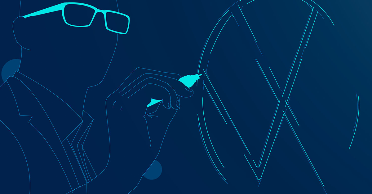
Official press image of the Volkswagen logo design. | © Volkswagen AG
Two letters in a circle have identified Volkswagen for more than eighty years. Here is what the VW logo means, who is said to have designed it, how it changed from 1937 to the flat 2019 redesign, and what the missing gap argument is really about.
The Volkswagen logo is one of the simplest and most recognised badges in the car world. It is a V placed above a W, both enclosed in a circle, and the two letters are the first letters of the company's name. Volkswagen is German for “people's car”, which is exactly what the brand set out to build when it was founded in 1937. The V stands for Volks, meaning people, and the W stands for Wagen, meaning car. Put together, the emblem is an abbreviation of the name, and it has worked as a shorthand for the company for more than eighty years.
| Brand name | Volkswagen, German for “people's car” |
| V | Volks, meaning people |
| W | Wagen, meaning car |
| Shape | V above W inside a circle |
| Traditional colours | Blue and white |
| Current design | Flat, two-dimensional, introduced in 2019 |
| Used on | Passenger cars and commercial vehicles |
The circle around the letters is usually read as a sign of unity and completeness, a shape that holds everything together and has no beginning or end. Volkswagen does not rely on a long official explanation for it, and that is part of the design's strength. A circle is easy to reproduce on a grille, a steering wheel, a wheel centre cap, a dealership sign or a phone screen, and the two letters inside remain readable even when the badge is very small. Few car emblems manage to be this plain and still be instantly identifiable from the far end of a car park.
Colour is the other part of the identity. For decades the logo has been shown in blue and white, a combination that gives it a calm, clean and dependable look. When Volkswagen introduced its current brand design in 2019, it kept the blue and white but added a new blue tone, which allowed more colour variants for use in advertising and digital media. The core idea stayed the same, which is why even people who have never owned a Volkswagen can usually describe the badge without having to think about it.
The emblem is used alongside the model names rather than in place of them. In its own communications Volkswagen points to established names such as Polo, Golf and Passat as a source of recognition, and to the brand labels GTI, GTE, TDI and R as short ways of conveying character. This matters for how the brand is organised. The logo identifies the company, the model name identifies the car, and the label identifies the version, so a shopper can tell at a glance which maker, which model and which variant they are looking at. That clear order is one reason the badge has stayed so simple.
The same logo is used across passenger cars and commercial vehicles. Volkswagen's 2019 brand design applied to both, so a Golf, a van and an electric ID. model all carry the same emblem and the same visual language. That consistency helps the company present itself as one brand, even though it sells everything from small city cars to large electric vehicles. It also makes the logo a useful starting point for understanding the company, because each change to the badge over the years reflects what the brand was trying to be at the time.
The sections below trace the logo from its disputed origin in the late 1930s through the postwar changes, the three-dimensional versions of the 2000s and the flat redesign of 2019. They also look at why the gap between the V and the W has caused so much argument, how the logo is used on today's cars, and what Volkswagen's new naming strategy for its electric models means for the way the brand is presented in the years ahead. Wherever the history is uncertain or disputed, the text says so and names the claim's source.
The honest answer is that nobody can say for certain. The company that became Volkswagen was established on 28 May 1937 as the Gesellschaft zur Vorbereitung des Deutschen Volkswagens mbH, set up by the German Labour Front, and it was renamed Volkswagenwerk GmbH on 16 September 1938. The emblem appeared in this early period, but the records of who drew it are incomplete, and several people have been credited over the years. The accounts differ on the name, the date and the circumstances, so this section sets out each claim and what is known about it.
| Company founded | 28 May 1937, as the Gesellschaft zur Vorbereitung des Deutschen Volkswagens mbH |
| Renamed Volkswagenwerk GmbH | 16 September 1938 |
| Credited designer (most cited) | Franz Xaver Reimspiess, Porsche engineer, reportedly paid 100 Reichsmark |
| Competing claim | Martin Freyer, said to have won a competition in 1938 (unverified) |
| Competing claim | Nikolai Borg, says he designed it in June 1939 |
| Court ruling | Vienna Business Court rejected Borg's claim in 2005 |
| Official origin | Not confirmed by surviving records |
The account most often repeated credits Franz Xaver Reimspiess, an Austrian engineer who joined the Porsche design office in 1934 and worked on the air-cooled engine for the Volkswagen. He was born in 1900 and died in 1979. The story goes that he won an internal design competition for the emblem and was paid a one-off sum of 100 Reichsmark, although some retellings give 50. The claim is cited to a Volkswagen company chronicle covering 1937 to 1945, and it is the account that most writers treat as the best supported, though the competition itself is not documented in detail.
Two other names appear in the story. The German artist Martin Freyer is said to have won a competition for a similar logo in 1938, but that claim is unverified. The Austrian graphic designer Nikolai Borg says he was commissioned in 1939 to create the emblem for that year's motor show, working under the engineer Fritz Todt, and that his version had no gap between the V and the W. Borg later disputed ownership of the design in court, which is why his name comes up so often in discussions of the logo.
The legal outcome is worth noting. In 2005 the Vienna Business Court rejected Borg's copyright claim, ruling that the logo had been registered as a trademark a year before the date on which he said he had designed it. That decision supports the view that the emblem existed before 1939 and that the version with a gap between the letters was the original. It does not, however, say who actually drew the first design, so the question of authorship remains open even though the court settled the claim in front of it.
The difficulty is partly a matter of timing. The surviving records from the late 1930s are incomplete. Volkswagen was set up under the Nazi government, and that context shapes how the early emblem is remembered. For readers who are tracing the logo, the safest approach is to treat Reimspiess as the most commonly cited designer and to note that Freyer and Borg made competing claims.
What is clear is that the emblem was a commissioned piece of company branding in the first years of the Volkswagen project, and that it was changed after the war to separate the brand from the symbols of the period in which it began. That postwar reworking, rather than the original drawing, is what produced the V and W in a circle that people recognise today. The next section follows the logo from the first emblem through each major redesign, using a timeline so you can see how the badge developed from the late 1930s to the present.
The Volkswagen logo has been redrawn many times, and the version on a car today is the product of a long process of simplification. The earliest emblem, used from around 1938 to 1939, placed the V and W inside a cogwheel and included a central design that resembled a propeller crossed with a swastika. It was an elaborate badge that reflected the period and the politics of the company's founders. That design did not last, and almost every later change moved the logo toward something plainer and more neutral.
| About 1938 to 1939 | V and W inside a cogwheel with a propeller-like central design |
| After 1945 | Cogwheel removed, V and W in a circle under British control of the plant |
| 1960 | Emblem placed in a square |
| 1967 | Square removed, circle returns in blue and white |
| 1978 | Bolder blue, double border |
| 1989 | Lighter blue and white, cleaner proportions |
| 2000 | Gradients and a three-dimensional look |
| 2012 | Stronger 3D effect, slightly smaller emblem |
| 2019 | Flat, two-dimensional redesign |
The Second World War changed the company and the emblem. After 1945 the factory at Wolfsburg came under British control, and the cogwheel was dropped after the war, leaving the V and W in a circle. Some accounts credit the British Army officer Ivan Hirst, who helped restart production at the plant, with streamlining the badge, although the details vary between sources. The postwar designs used softer colours, and the simplicity of the new emblem helped the company present itself as a maker of everyday cars rather than as a state project.
From there the logo evolved through a series of small changes that design histories date by decade. In 1960 the emblem was placed in a square, a shape that suggested stability. In 1967 the square was removed and the circle returned in blue and white. In 1978 the blue had become bolder and brighter, and the lettering was framed by a double border. A cleaner, lighter version arrived in 1989, with more elegant proportions. Design timelines agree on these years, although the details of each design vary between sources, so the table below is best read as a general guide to the sequence.
The big change came in 2000, when gradients were added to give the emblem a three-dimensional look, with silver-toned white and a deeper blue. This followed the trend of the time, when car badges were designed to look like polished chrome objects. In 2012 the effect was strengthened, with a slightly smaller emblem and sharper, bolder letter lines, and this is the version drivers remember from the 2010s. It looked rich on a grille, but it was harder to use on screens and small icons.
That problem is what led to the next step. As more of the company's communication moved to apps, websites, infotainment screens and social media, a badge built around shadows and highlights became a handicap. A logo had to work as a flat icon on a smartwatch as well as a chrome badge on a bonnet. Volkswagen's designers concluded that the three-dimensional effects had run their course, which set the stage for the 2019 redesign described in the next section. The company was not alone, since BMW and Nissan had also flattened their logos around the same time.
Looking at the whole sequence, a clear pattern emerges. The logo began as a complicated emblem tied to a particular era, was simplified after the war into a basic circle, was refined repeatedly in blue and white, became three-dimensional in the digital age and then returned to flat simplicity. Each step reflected how the company wanted to be seen at the time, and each one kept the V and W at the centre. That continuity is the reason the brand can change its look so often without losing recognition.
Volkswagen unveiled its current logo at the Frankfurt Motor Show in September 2019, alongside the electric ID.3, as part of a complete new brand design. The new emblem is flat and two-dimensional, with no shadows, highlights or chrome effect, and its lines are much thinner than before. The change was presented as the start of a new era for the company, with Jürgen Stackmann, then a member of the brand board, saying that the new brand design marked the start of a new era for Volkswagen.
| Unveiled | September 2019, Frankfurt Motor Show, alongside the ID.3 |
| Developed by | Volkswagen Design and Marketing in-house, with chief designer Klaus Bischoff and CMO Jochen Sengpiehl |
| Style | Flat, two-dimensional, thinner lines, floating W |
| Project | Nine months, 19 internal teams, 17 external agencies |
| Scale | 171 markets, 154 countries, about 70,000 logos, about 10,000 dealer and service sites |
| New elements | Sound logo, female brand voice, new blue tone, moving frame |
| Rollout | Europe first, rest of world from 2020 |
The redesign was developed in-house by Volkswagen Design and Marketing rather than by outside agencies, with chief designer Klaus Bischoff and chief marketing officer Jochen Sengpiehl speaking for the project. Bischoff described the design as an authentic platform for presenting electric mobility, and the guiding mottos were “digital first” and “no filter”. Sengpiehl said the brand wanted to be more human and livelier and to tell authentic stories. The aim was a logo that worked equally well on a building, a car and a small screen.
Visually the change is easy to describe. The V and W and the circle all use narrower strokes, and the bottom of the W no longer touches the circle, so the W appears to float. The corners of the letters are slightly rounded, while the angles where the letters meet the circle stay sharp. The logo also gained a “moving frame”, which allows it to be positioned flexibly in digital interfaces. Light became part of the idea too, with the company saying that light is the new chromium, and the logo is now illuminated on vehicles, at brand locations and at dealerships.
The rebrand went well beyond the badge. Volkswagen replaced its brand claim with its first sound logo, and it moved to a female voice for its advertising in almost all markets, replacing the male voice that had been used for decades. The visual language became bolder and more colourful, with a focus on people and realistic situations rather than perfectly staged photographs of cars. The brand design was applied to both passenger cars and commercial vehicles, so the whole company presented one face to customers.
The scale of the change was large. The project ran for nine months and involved 19 internal teams and 17 external agencies, and the new design covered 171 markets in 154 countries. About 70,000 logos had to be replaced across roughly 10,000 dealer and service facilities, although the interior architecture of the dealerships was not changed. The new logo was to appear first on the high-rise at the company headquarters in Wolfsburg, and Europe changed over first, with the rest of the world following from the start of 2020. In New Zealand the changeover happened in February 2020.
Design writers noticed that the new emblem broke some of Volkswagen's own earlier rules. The old trademark specifications set formulas for line width, stroke angles and the gap between the V and the W, and the 2019 design has thinner lines, less consistent stroke angles and a wider gap. Rather than being a flaw, this was the point. The company chose flexibility and clarity in digital use over strict adherence to the older drawing, and the result is a badge that can be scaled from a headquarters tower down to a mobile app icon without losing its identity.
One of the most popular internet arguments about the Volkswagen logo concerns a gap. Many people are certain that the V and W were once joined, with the letters touching in the middle, and that the badge was later changed to include a space between them. Others say this is a false memory of the kind sometimes called the Mandela effect. The argument has produced a surprising amount of online debate, and it is useful to separate what the evidence shows from what people remember.
| Official drawings | Show a gap between the V and the W |
| Court ruling | Vienna Business Court, 2005, rejected Borg's claim, trademark predated his design |
| Gapless versions | Probably supplier or plant variations, looser style guide use |
| 2019 design | Wider gap, W floating above the circle |
| Best evidence | Dated official artwork and catalogues, not stock photos |
Vintage Volkswagen specifications show a space between the V and the W. The gap was present in the company's drawings, which supports the view that the version with a gap is the original. That fits the 2005 court ruling in Vienna, which found that the logo had been trademarked a year before Nikolai Borg said he designed his gapless version in 1939. On the official record, then, the gap was always there, and the gapless design is better seen as a variation than as the first emblem.
Why do so many people remember a joined version? The explanation is probably a mixture of causes. Badges were made by different suppliers and in different plants around the world, and the gap could be tiny, sometimes little more than a hairline. Some versions that look joined may have come from third parties or from looser adherence to the style guide. Photographs, stock images and even a film appearance can show badges where the gap is hard to see. Together these give plenty of material for a memory of a joined logo, even if the official artwork never had one.
The gap matters again with the 2019 design. The redesigned emblem deliberately leaves the bottom of the W hanging above the circle, which changes the way the space between the letters and the ring reads. The designers wanted a lighter, more open look, and the new proportions are a break from the older heavier artwork. For someone who remembers the badge as a solid, joined shape, the new logo can feel very different, even though the basic idea of a V over a W in a circle has not changed.
The debate shows how closely people look at car badges. A logo that appears on millions of vehicles becomes part of everyday life, and small changes to it are noticed and discussed. Volkswagen has been through this before, since each major redesign from the cogwheel to the flat emblem has been followed by comment from owners and designers. The company's willingness to alter its badge to suit the times, while keeping the V and W recognisable, is one of the reasons the brand has remained easy to identify across so many decades.
If you want to check a particular badge, the best method is to look at dated official artwork, brochures and parts catalogues rather than at stock photographs. A badge on a used car may be a replacement, and badges differ by market and model year. For collectors and restorers, getting the correct emblem for the correct year is a real concern, and the timeline in the previous sections is a useful starting point. For everyone else, the gap is an entertaining detail that shows how much attention a simple pair of letters can attract.
For most of its modern history the Volkswagen logo has been blue and white, and the 2019 redesign kept that identity while widening it. The company added a new blue tone to the palette, which made more colour variants possible, and the brand design also introduced a bolder and more colourful visual language for advertising. The emblem itself still reads as a blue and white badge, but it is now used in more flexible combinations.
| Main colours | Blue and white, with a new blue tone added in 2019 |
| Locations on a car | Front, rear, steering wheel, wheel centre caps, interior trim |
| Lighting | Illuminated on vehicles and dealerships, lit front and rear logo on ID. Polo Style |
| Design language | Pure Positive, first used on the ID. Polo |
| Digital features | Moving frame, flat design, sound logo |
| Brand labels | GTI, GTE, TDI and R |
On the car, the logo appears in several places. The largest is the badge on the front, normally on the grille or the bonnet, with another on the tailgate or boot lid. A third sits at the centre of the steering wheel, and smaller versions appear on wheel centre caps and on interior trim. The brand's labels, such as GTI, GTE, TDI and R, appear next to the emblem or on separate badges, and they tell the buyer which version of the model they are looking at. The result is a badge system in which each mark has a clear job.
Light has become part of the way the logo is used. The 2019 brand design describes light as the new chromium and the logo is illuminated on vehicles, at brand locations and at dealerships. On the electric ID. Polo, Volkswagen says the Style trim has an illuminated VW logo at the front and rear, alongside IQ.LIGHT LED matrix headlights and an illuminated light strip. This turns the badge from a piece of chrome into a lit signature, which is especially useful on electric cars that have a closed front without a traditional grille.
The same idea extends to the way the cars are designed. Volkswagen calls its new design language Pure Positive, and the ID. Polo is the first production model to use it, with crystal-clear proportions, a C-pillar inspired by the first Golf and a powerful rear end. The company says its timeless, clear design is one of its core strengths and that the brand's design DNA is developed over decades. The logo fits into that approach because it is simple, geometric and easy to recognise, which suits a design language built on clarity rather than decoration.
Digital use is just as important as the badge on the car. The flat emblem is used on websites, apps and screens, where a simple outline is clearer than a rendered chrome effect. The moving frame introduced in 2019 lets designers position the logo flexibly inside digital layouts. Because Volkswagen replaced its brand claim with a sound logo at the same time, the company now has a visual and an audible identity that can be used together across showrooms, adverts and vehicles.
For anyone who needs to use the logo, for example a dealer, a journalist or a club, the correct approach is to use official Volkswagen artwork and to follow the company's brand guidelines. The emblem is a registered trademark, and altering the proportions, colours or the gap between the letters can create a version that looks wrong to people who know the brand well. The easiest way to get it right is to download the logo from Volkswagen's official media resources and to avoid redrawing it from a screenshot or a photograph.
As of late 2026 the flat 2019 emblem is still the logo on Volkswagen's cars, and Volkswagen's official releases announce no redesign. That makes it one of the longest-lasting recent designs for the brand, which has changed its badge often in the past, and it suggests the flat style is likely to remain for some time. The more interesting changes are happening around the badge, in the names of the cars it appears on and the electric technology behind them.
| Current logo | Flat design introduced in 2019, no replacement announced in official releases |
| Naming strategy | Established names move to electric ID. models, announced in 2025 |
| First example | ID. Polo, previously the ID. 2all study |
| ID. Polo Trend price | From 24,995 euros in Germany |
| ID. Polo range (provisional) | Up to 454 km (52 kWh), up to 329 km (37 kWh), WLTP |
| ID. Polo GTI | Planned for 2027 |
| New small and compact EVs | Four, gradually from 2026 |
In 2025 Volkswagen announced a new naming strategy for its electric cars. The company said it would move the names of its established bestselling models onto its all-electric ID. family, so buyers can find their way through the range more easily. The first car with a new name is the ID. Polo, which was previously shown as the ID. 2all study and is due to reach the market in 2026. More established names will follow with each new model generation, and combustion-engine models will keep their current names and be sold alongside the electric ones.
The ID. Polo shows how the logo and the names work together. The Trend version starts at 24,995 euros in Germany according to Volkswagen, with pre-sales due to start from the end of April 2026, and an ID. Polo GTI is planned to follow in 2027. The electric Polo is offered with a 52 kWh battery with a provisional range of up to 454 kilometres on the WLTP cycle and a 37 kWh battery with up to 329 kilometres. It carries the same flat emblem as every other Volkswagen, and in the Style trim that emblem is lit.
Volkswagen has said that four new small and compact electric cars will gradually reach the market from 2026, and that its stated goal for the next five-year push runs to 2030. As these cars arrive, the logo will appear on a wider mix of vehicles than ever, from city cars to larger electric SUVs and vans. A badge that is simple, flat and illuminated suits that range, because it can be applied consistently to very different shapes without needing to be redrawn for each one.
The logo and the model names are the two constants in a changing line-up. The badge identifies the company, and the names identify the cars, with Volkswagen itself pointing to Polo, Golf and Passat as names with high recognition value. Labels such as GTI, GTE, TDI and R then tell the buyer which version they are looking at. As more of these familiar names move onto electric ID. models, that order becomes more important, because a shopper needs to know at a glance which maker, which model and which powertrain they are being offered, and the emblem on the front is the first part of that answer.
The Volkswagen logo has travelled from a disputed and politically charged emblem in the late 1930s to a flat, lit, digital-friendly badge that works on a car, a phone and a skyscraper. Its history is a story of constant simplification, and its meaning, a people's car, has not changed. As Volkswagen moves its best-known names onto electric cars, the V and W in a circle will stay the thing that ties it all together, and it is likely to remain among the most recognisable emblems in the industry.