 Brands
Toyota Logo — The Real Meaning Behind the Three Ovals
AI-generated concept illustration — Toyota logo evolution. | Rev N Rise
You have seen it on more roads than almost any other symbol on earth — three overlapping ovals, simple enough to draw from memory, instantly recognisable from a hundred metres away. Most drivers assume it is nothing more than a stylised letter T. It is that. It is also considerably more than that, carrying nearly a century of company history, a hidden reference to the industry Toyota came from before it built a single car, and a design story that took more than one attempt to get right.
Before it was an automaker, the company was Toyoda Automatic Loom Works, founded by Sakichi Toyoda to manufacture textile machinery. When the company launched its automobile division, it faced a decision that would shape its identity for the next century: keep the founder’s family name, or find something new.
It chose something new, and the reasoning was genuinely practical rather than sentimental. Toyoda literally translates to “fertile rice paddies” in Japanese — an image rooted in traditional agriculture that sat awkwardly against the ambition of a modern car manufacturer trying to compete on a global stage. There was also a numerological consideration that mattered deeply in Japanese business culture at the time: written in Japanese katakana, Toyota requires eight strokes, while Toyoda requires ten. Eight is considered a lucky number in Japanese culture, associated with prosperity and continuous growth. Toyota Motor Corporation was officially established in 1937, and the family name Toyoda was set aside for the brand the world would come to know.
Toyota’s very first automotive emblem, used briefly around 1935, was a simple red wordmark rendering the name in Japanese katakana characters — functional, but not yet the identity the company needed for the ambitions it had. To solve that, Toyota did something unusual for the era: it opened a public design competition, inviting submissions for a new brand mark that could represent the company both domestically and internationally.
The response was enormous. Toyota received roughly 46,000 design submissions — a genuinely staggering number for a design contest run nearly ninety years ago. From that pool, the company selected a design built around three Japanese katakana characters arranged inside a circle, paired with the company name spelled out beneath in Roman letters. It was the first Toyota emblem to combine Japanese heritage with international legibility — a balance the brand has returned to in every subsequent redesign.
As Toyota expanded into international markets through the late 1950s and 1960s — a period that included the brand’s early push into the United States and the launch of models like the Land Cruiser — the company moved away from circular emblems entirely, adopting a clean bold serif wordmark spelling out TOYOTA in capital letters. The design was deliberately understated: no symbol, no ornamentation, just confident, legible typography intended to project stability and reliability to markets that did not yet have deep familiarity with Japanese manufacturing.
In 1969, Toyota refined the wordmark again, switching to a sans-serif typeface — a genuinely bold move for the era, signalling the company’s willingness to modernise its visual identity in step with the industry around it. This sans-serif wordmark, refined slightly again in 1978, carried Toyota through two decades of significant global growth, including the oil crisis years that dramatically boosted demand for Toyota’s fuel-efficient vehicles in Western markets.
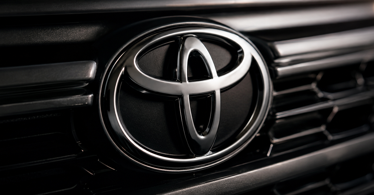
The logo every driver recognises today — three interlocking ovals — was introduced in October 1989, and the timing was deliberate on two fronts. It coincided with Toyota’s 50th anniversary as an automaker, and it launched alongside the debut of Lexus, Toyota’s new luxury division, which needed the parent company to project a more premium, globally sophisticated visual identity to support its move upmarket.
The design consists of two perpendicular ovals nested inside a larger, encompassing oval. Toyota has explained the meaning across several official statements over the decades, and the interpretation has remained remarkably consistent: the two inner ovals represent the interlocking hearts of Toyota and its customers — a symbolic handshake between manufacturer and driver. Viewed together, those same two ovals also form the shape of a letter T, a subtler visual cue that reads clearly in Western markets without requiring explanation. The outer oval represents the wider world, embracing and surrounding the relationship between company and customer.
What makes the three-oval logo genuinely clever design work is that it carries two entirely different, equally valid readings depending on the cultural lens applied to it — and both were intentional. In Western markets, the overlapping shapes read primarily as a stylised letter T, immediately legible and brand-appropriate without any further explanation needed.
In Japanese and broader East Asian markets, the same design carries a different, deeper reading. The interlocking, overlapping nature of the three ovals reflects the concept of “Wa” — a foundational principle in Japanese culture emphasising harmony, balance and collaborative unity between individuals and the group. The ovals don’t simply sit beside one another; they overlap and depend on each other structurally, which is precisely the visual metaphor Wa calls for. This dual readability — a clean Western letterform and a rich Eastern cultural symbol occupying the exact same set of lines — is the single most sophisticated aspect of the design.
Here is the detail that separates casual Toyota owners from people who have actually studied the badge on their steering wheel. Look closely at the negative space created where the two inner ovals overlap and cross the outer oval’s boundary — some designers and brand historians have observed that the resulting shape can resemble a needle passing through fabric, threading in and out of the material.
Whether this was a fully deliberate design choice by the winning submission or a happy interpretive coincidence embraced afterward, it connects directly back to the company’s actual origin. Toyota did not begin as a car company. It began as Toyoda Automatic Loom Works — a textile machinery manufacturer, building automated looms decades before Sakichi Toyoda’s son, Kiichiro Toyoda, pushed the family business into automobile production. A needle-and-thread reading hidden inside the logo of one of the world’s largest car manufacturers is a genuinely elegant piece of brand storytelling, whether it was planned from the outset or discovered by an observant designer years later.